Citi Mobile App Feature
Giving users ways to achieve their financial goals without losing track of their lives.
Role
User Research, UX/UI Design, Interaction Design, User Testing
Timeline
5 Weeks (20 hours week)
Tools
Figma, Adobe CC, Zoom, Asana
Overview
As more and more people replace in-person branch visits with online banking, customers expect banks to maximize digital interactions to protect their health, as well as their money and personal details. That is why Citi Bank wants to use its reach to improve the financial health of its customers through its current mobile app. The features that they are offering focus primarily on spending and making payments. However, Citi Bank would like to round out its offerings by providing users with personalized features to manage their personal finances better.
Problem
American households are involved in very light financial planning, such as basic budgeting and savings goals. Consequently, customers need help to stay on top of their finances and not lose track of their financial goals.
Solution
Design a new finance management feature that helps users customize and track saving goals while enhancing two other features to give users more control over their budget and credit scores.
The Market In Perspective
Mobile banking has exploded since the pandemic hit, and more people are replacing in-person branch visits with online banking. However, that is not the only thing that the pandemic has changed in this industry. Now, customers, more than ever before, expect banks to maximize efforts to protect their physical and financial health. Some important insights below:
Who uses mobile banking?
👱♀️
97%
of millennials
🧔
91%
of Gen Xers
👵
79%
of baby boomers
What Users Do
📆
All Set in Autopay
💸
Swipe to Transfer
📸
Deposit Completed
What Users Expect
🔒
Security
📳
Personalized Alerts
📊
Money Management
Checking account balances is not enough. Users want tools to manage their finances.
Empathy Findings
Does
🤳
- Track paychecks and account’s balances through the app
- Pay bills and transfer money to friends and family
- Manage their finances when their paycheck gets deposited
- Visit banks’ branches in-person only when depositing cash
- Split their paycheck between paying bills, saving goals, and personal spending
Thinks
🤔
- Customize savings and spending will help them to manage their finances
- They need alerts to keep in mind their spending
- Mobile banking apps should unify credit scores
- They need to see the most important information at a glance
- The bank has to take action immediately if there is a sign of fraud
Feels
🙋♂️
- Accomplished – When saving money and tracking their spending
- Frustrated – Remembering or recalling information about past transactions
- Impatience – When they cannot find information quickly
- Safe – When the bank alerts them of fraud and takes action
- Annoyed – Because each bank has its own credit score
“If the app shows me ‘you actually saved this amount of money’ without even being aware of it. That would be great”
“I have a saving goal for every year. So, every moth I have to save a specific amount of money to get to that goal.”
“I would like to customize based on my lifestyle or my history of spending money. You know. Show me a pattern”
Balancing Efforts
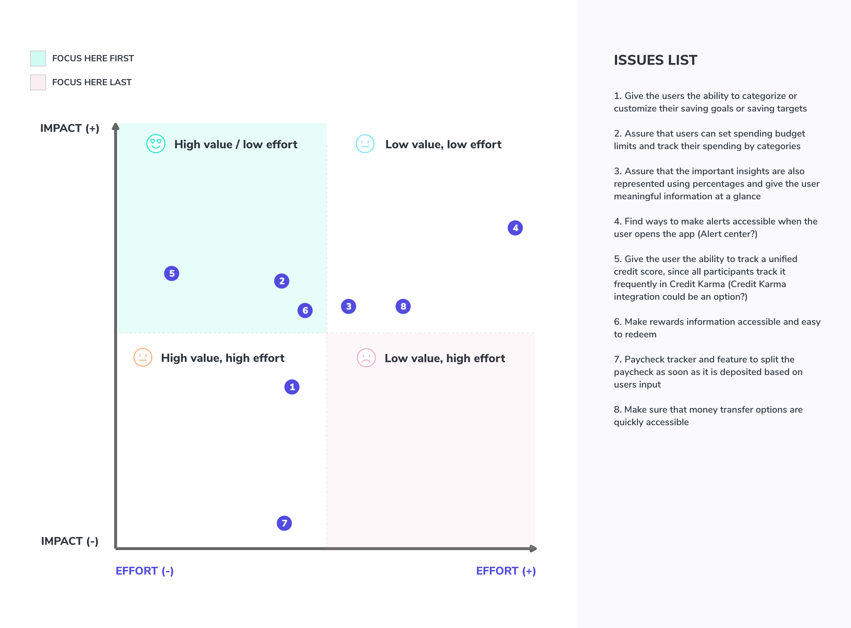
After putting together the primary and secondary research results, it was time to narrow down the scope. It was clear to me that personal finance management was the way to go. However, I had to balance what offers more value without significantly affecting the timeline of the project. So, using the effort-impact matrix, I decided to focus on:
- Issue #1: Give the users the ability to categorize or customize their saving goals or saving targets
- Issue #2: Assure that users can set spending budget limits and track their spending by categories
- Issue #5: Give the user the ability to track a unified credit score since all participants track it frequently in Credit Karma
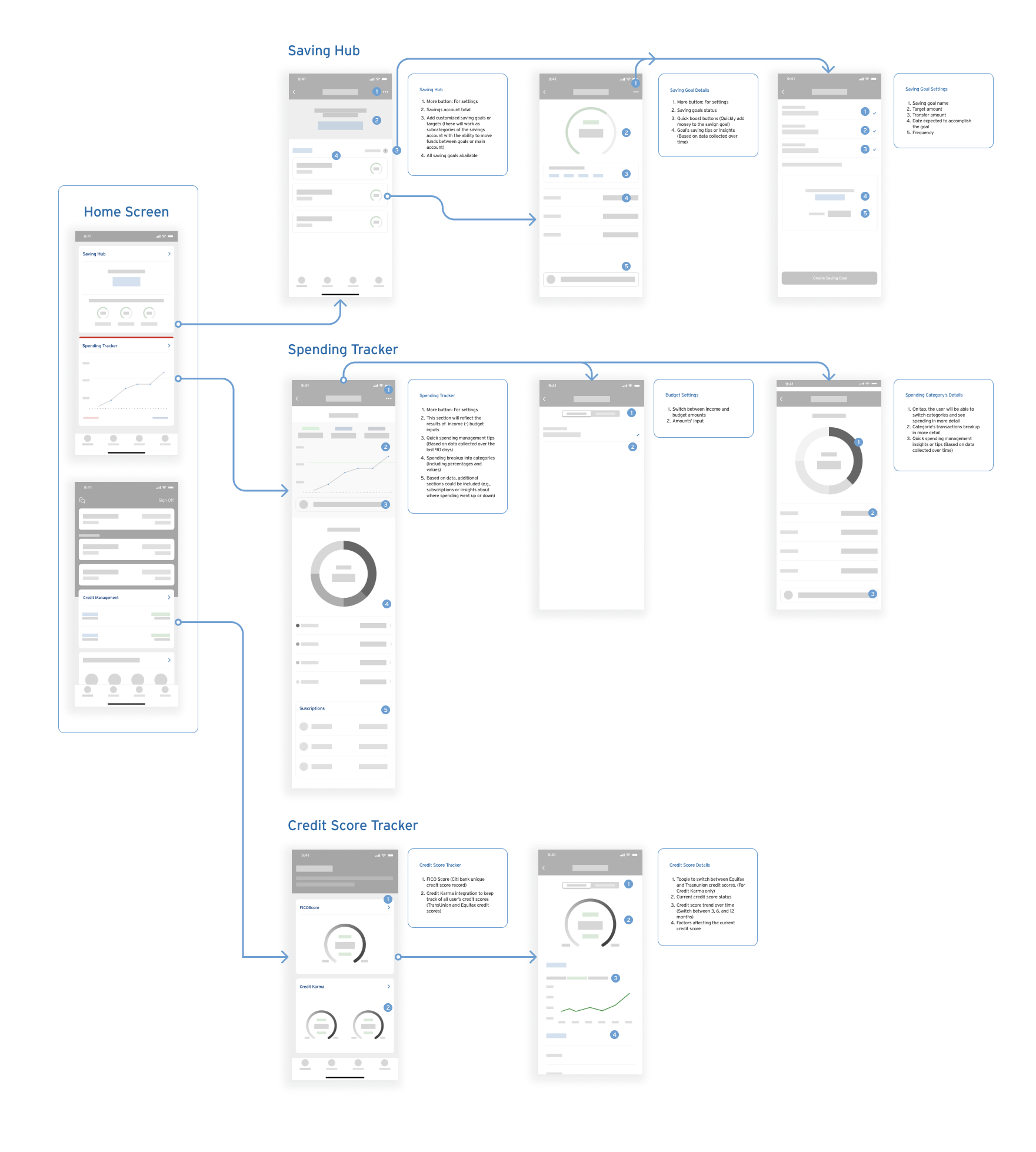
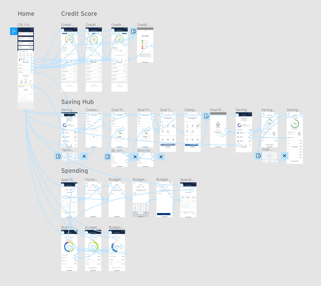
Mapping With Wireflows
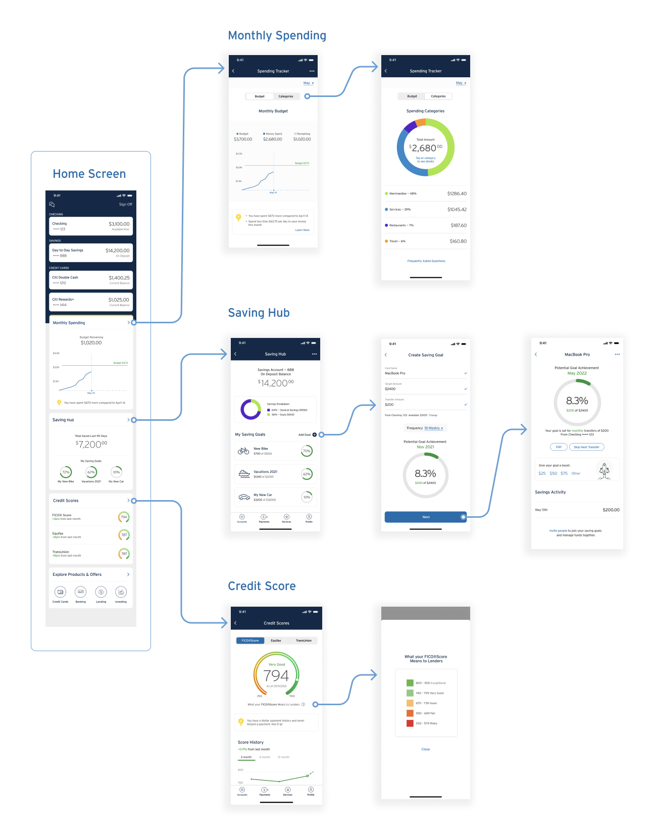
I started connecting the dots with a clear idea of what the task flows should be. However, the challenge here was to build a flow the respects the information architecture in place; while designing a user interface that aligns with the existing app’s design system.
Giving Users More Control
Giving users more control over their finances was not an easy task. I had to redefine some flows without affecting the app’s design patterns. For instance, the actual app has a feature called “Ways to Save” where the user can set frequent automated transfers to the savings account. But, how to make that current flow work if I include traceable goals? In theory, it sounds easy, but it was a big challenge when putting the pieces together. Some results below:
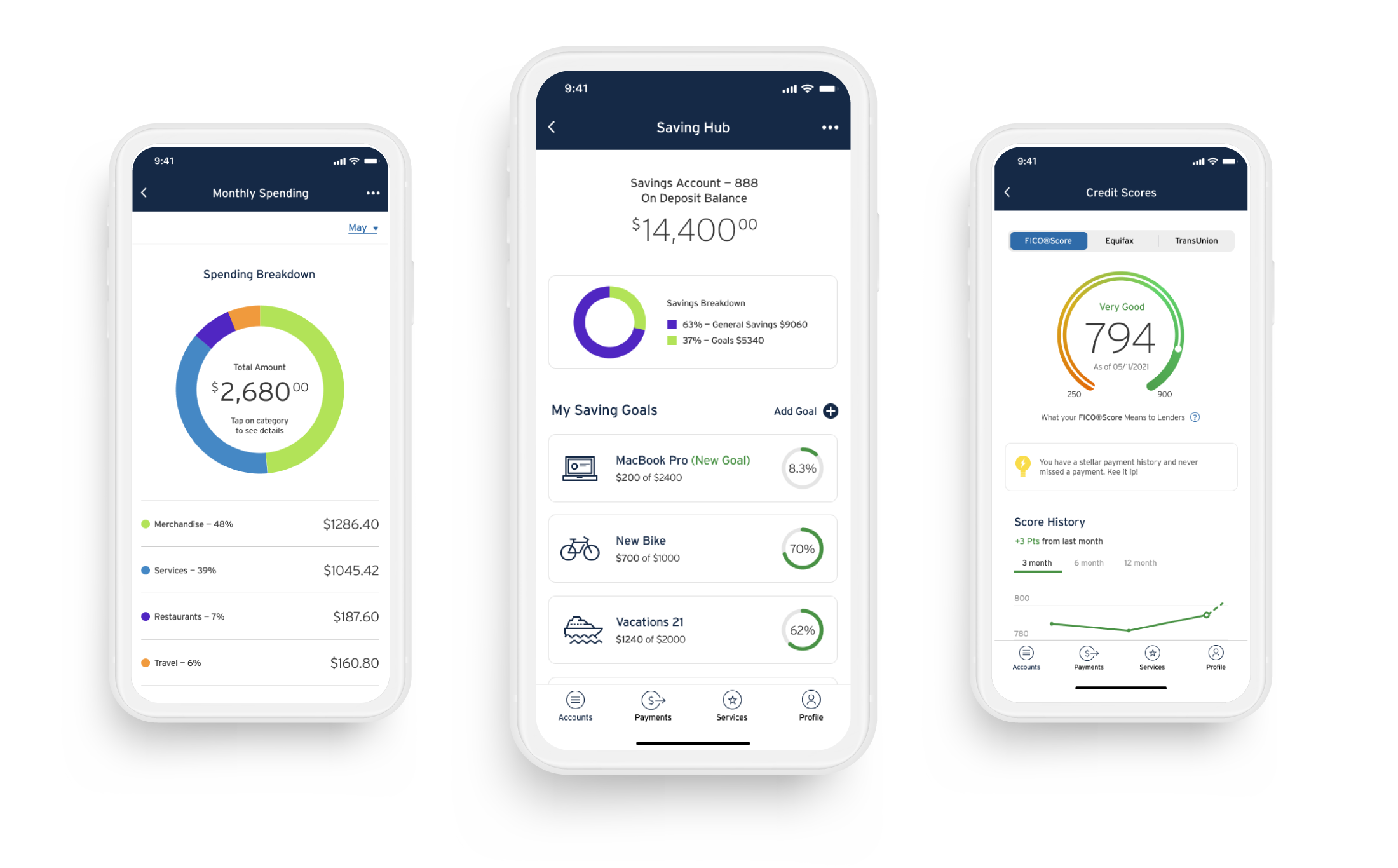
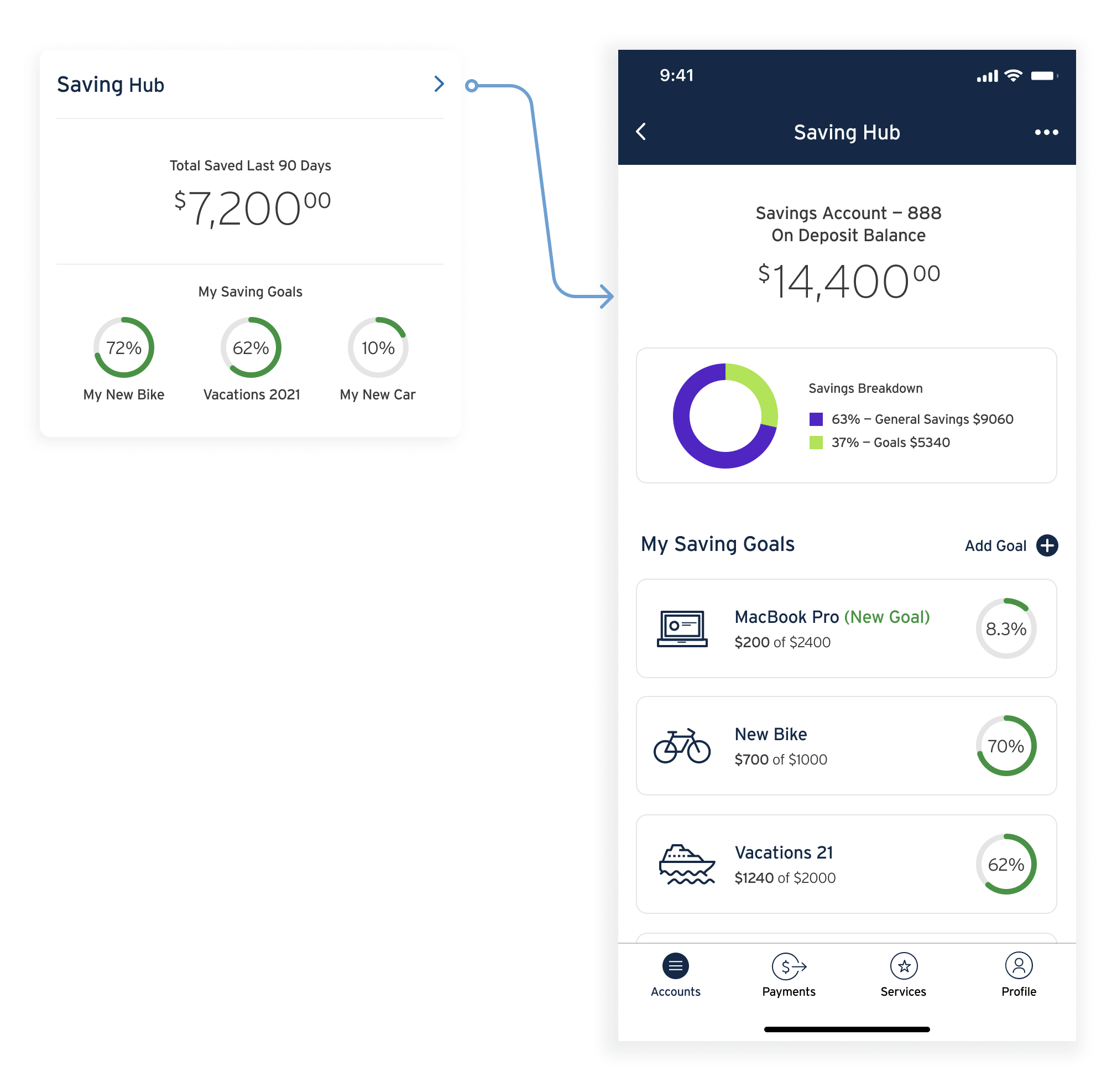
Saving Hub
Users can keep track of their saving goals. Goals will work as subcategories of the main savings account, and users can edit, un-enroll, skip a transfer, or give them a boost.
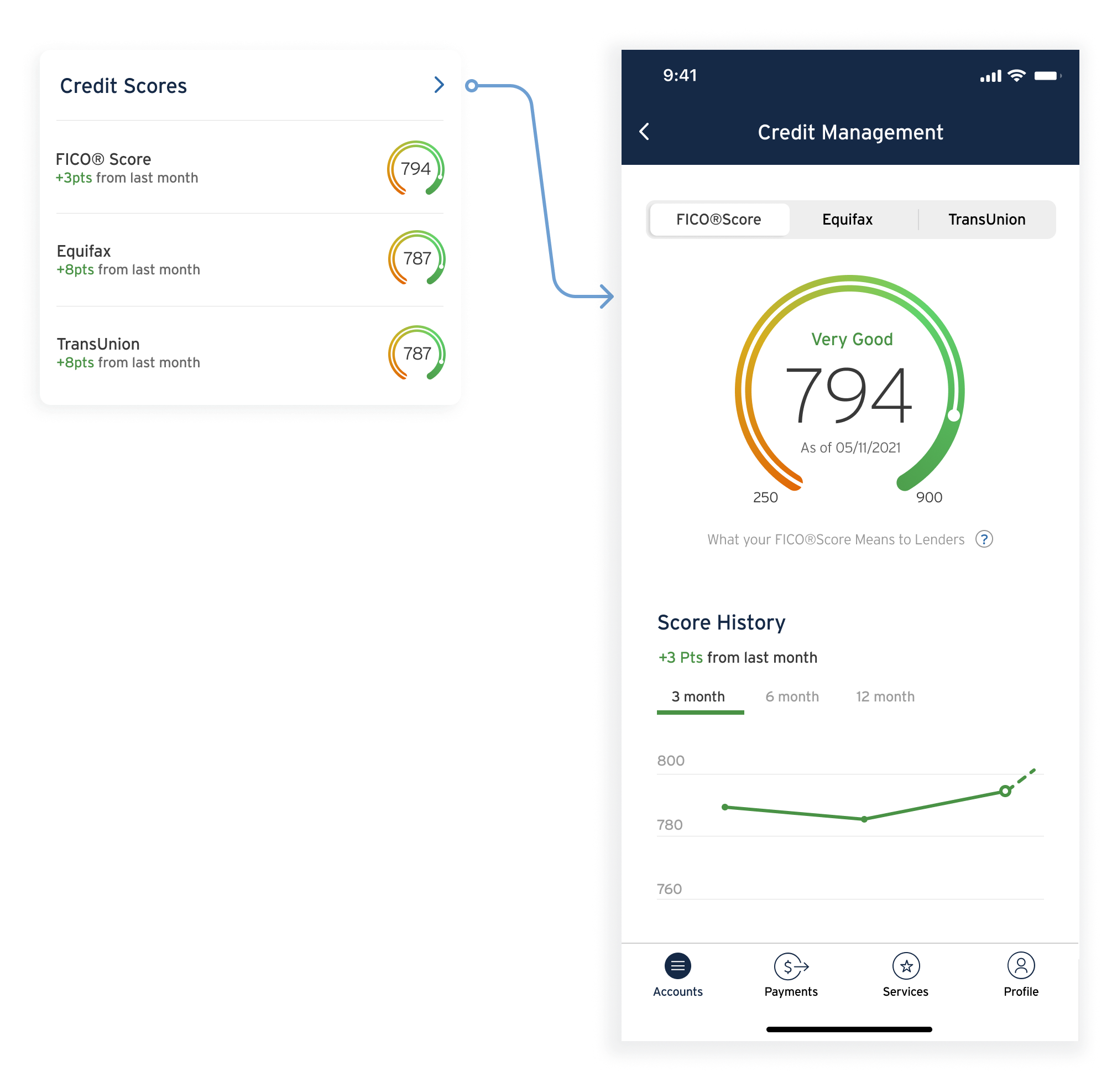
Credit Scores
A quick snapshot of the credit scores will help users scan the information and navigate the credit history.
Monthly Spending
Users believed that setting a cap on their spending was not enough. They also wanted to know where their money was going every month. This feature enhancement helps users track their spending by categories and dig into the details.
Respecting Design Patterns
As I mentioned previously, the goal for the wireframes was to design a user interface that aligns with the existing app’s design system and respects the design patterns that are already in place in the Citi Mobile App.
Usability Testing
I performed moderated remote and in-person usability testings via Zoom and Figma Mirror, respectively. I used 4 scenarios completed by 4 users aged between 28-36. Among the main goals of the usability testing were to evaluate the overall design flow and identify barriers that prevent the user from accomplishing the given tasks. Three out of four participants were actual users of the Citi Mobile App, while one participant was a Capital One user.
Addressing Usability Testing Issues
Overall, participants felt the features offer valuable information at a glance. They qualified the design flow as clean, organized, and easy to navigate. However, one of the users had a hard time updating the budget, and two others have doubts about how to find their spending by categories. Despite that, the severity of the issues found during the testing was low. They didn’t prevent participants from using and understanding the personal finance management tools.
Quick Access Links
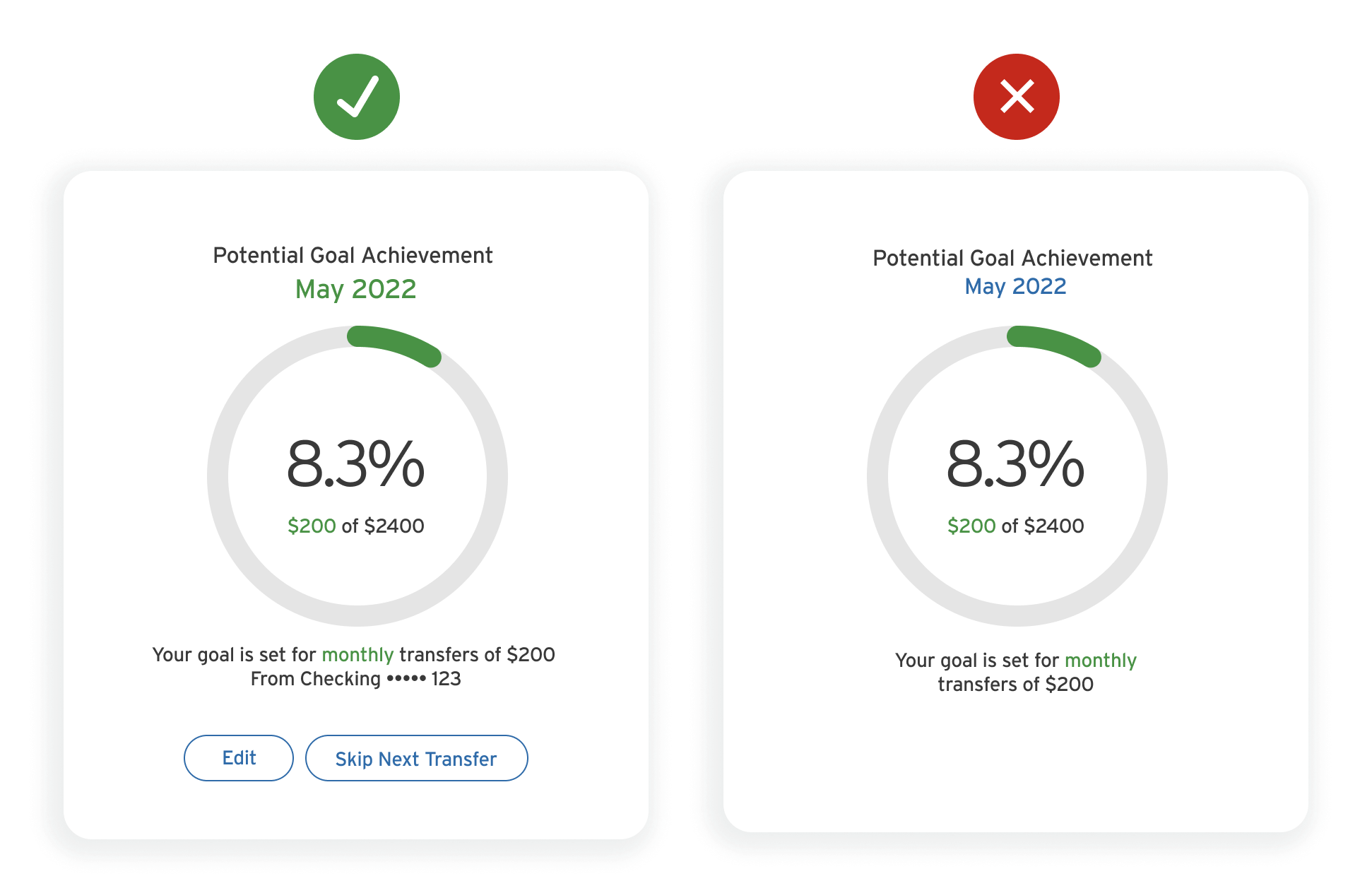
Users wanted quick access links when updating a saving goal and have information about the account where the money is coming from.
Goal Categories
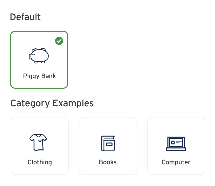
A simple but very frustrating issue for users. Two out of four participants were particularly frustrated when selecting a category for their saving goal. They wanted to have a default option for those who don’t want to choose a category.
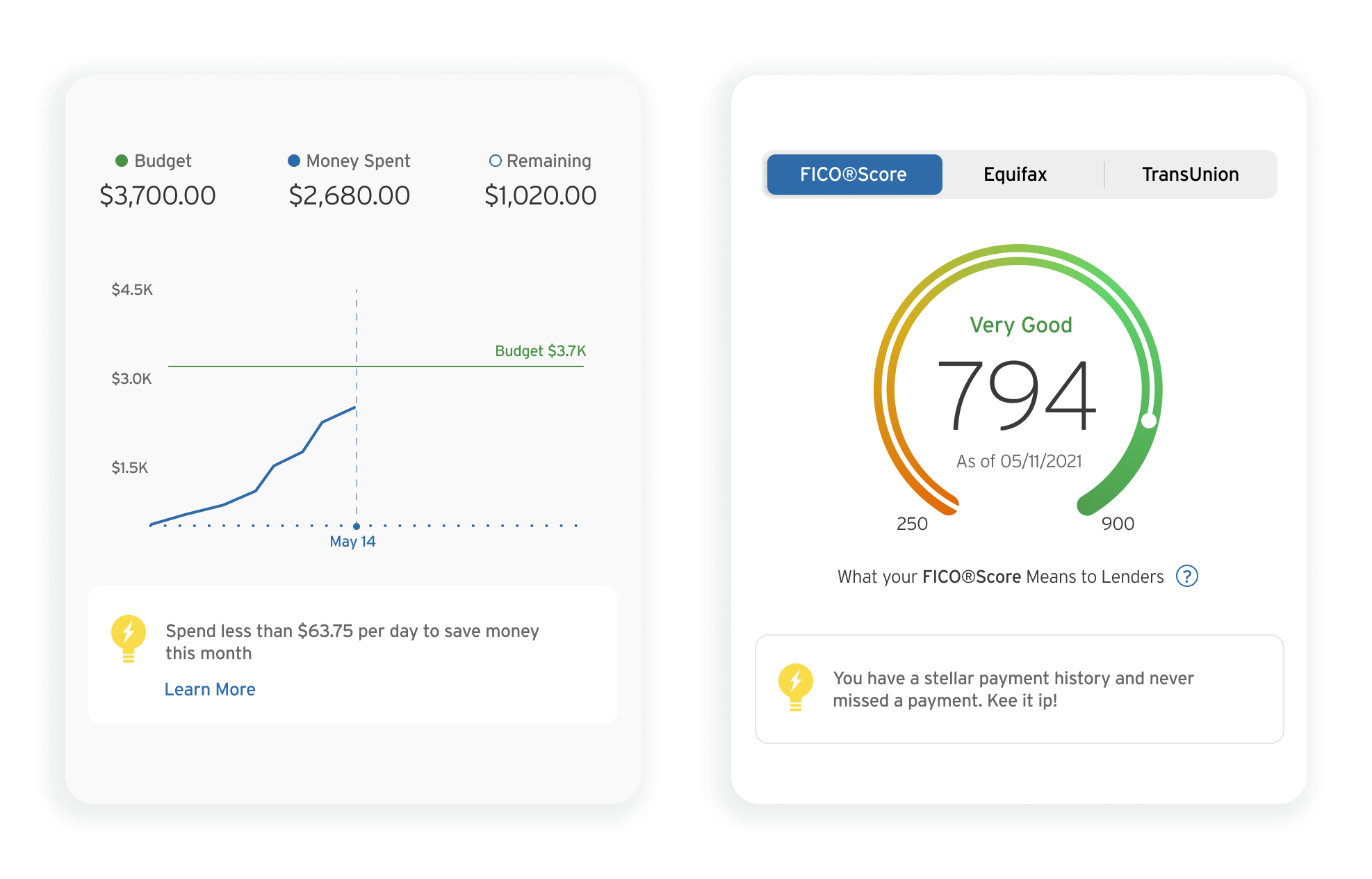
Insights and Tips
Users recommended make the tips and insights messages more visible and, in some cases, cheerful.
Wrapping Up
This study has probably been the most challenging case study I have completed because of the amount of information. I initially believed that bringing to life a feature into an existing design system would make the process smooth.
However, that was not exactly the case. This study required a deep understanding of the app’s flows and information architecture. Also, the secondary research and especially the user interviews resulted in a large amount of valuable information. So, the challenge was to narrow down the focus to design or enhance a feature that makes users’ life easy.
So for that, I concentrated my efforts on designing features that help users customize saving goals, track spending, and have their credit score at a glance. Luckily, participants qualified the design flow as clean, organized, and easy to navigate, and more importantly, those tools would help their personal finance management.
