MakeaList App
A simple way of making and sharing shopping lists with friends and family.
Role
User Research, UX/UI Design, Interaction Design, User Testing
Timeline
6 Weeks (20 hours week)
Tools
Adobe XD, Adobe CC, Zoom, Asana
Overview
Grocery shopping planning is one of the most basic activities in a household. Although shopping lists today look different from when people needed a piece of paper to plan grocery shopping, there is still the need to organize and collaborate on shopping planning. Moreover, ensuring one trip to the grocery store can save time, money and, more important, keep everyone happy at home.
Problem
Although grocery shopping planning is one of the most basic activities in a household, users still struggle to make, organize and share shopping lists with friends and family.
Solution
The goal is to create an app (MVP) that simplifies grocery shopping planning among family and friends. Giving users the ability to make and share shopping lists with ease.
Grocery Shopper Trends
The Numbers
The Habits
🍛
Meal Planning
🍱
Fully Stocked
👨🍳
Cooking More
Empathizing With Shoppers
“The downside of having a paper list is that I have to write the same products every time we do the planning.”
“It’s very annoying when you don’t know what to cook. Today you make a soup, and tomorrow you don’t know what else to do”
“If I walk through a store aisle without a list, I tend to pick and buy things that are not necessary”
Does
🍽
- They sit together usually in the dining room to plan the grocery shopping
- They do the groceries at least once every two weeks to keep their food fresh
- They are ok overstocking products if they find a good deal or coupon
- They use the stores’ apps to find deals and coupons but not for planning
- Organize the lists by product categories or store layout.
Thinks
🤔
- Having a shopping list helps them to buy only what they need
- Making a weekly meal plan reduces food wasting
- Shopping for groceries online requires too much input
- They have more control of produce’s freshness if shopping in person
- Two weeks is the ideal range to keep the groceries fresh
Feels
🤦♂️
- Accomplished – Taking advantage of stores’ coupons and saving money
- Frustrated – When they realize they forgot something despite making a list
- Secure – When they can pick and choose the groceries in person
- Discontent – When they cannot control their food inventory efficiently.
- Positive – When they can vary their weekly meals
- Disappointed – When they waste food and have leftovers
The Ups & Downs
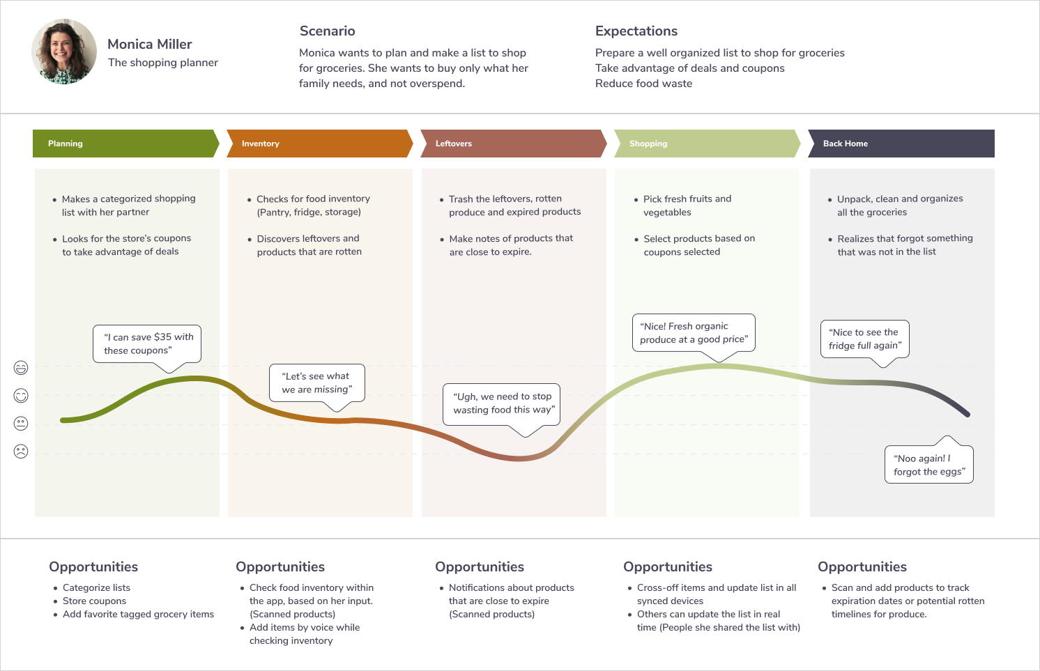
To get a holistic view of the grocery shopping planning experience, I created a customer journey map. Through the customer journey map, I uncovered moments of both frustration and delight throughout a series of interactions. Moreover, the journey mapping helped me uncover opportunities to address customers’ pain points and create a better user experience.
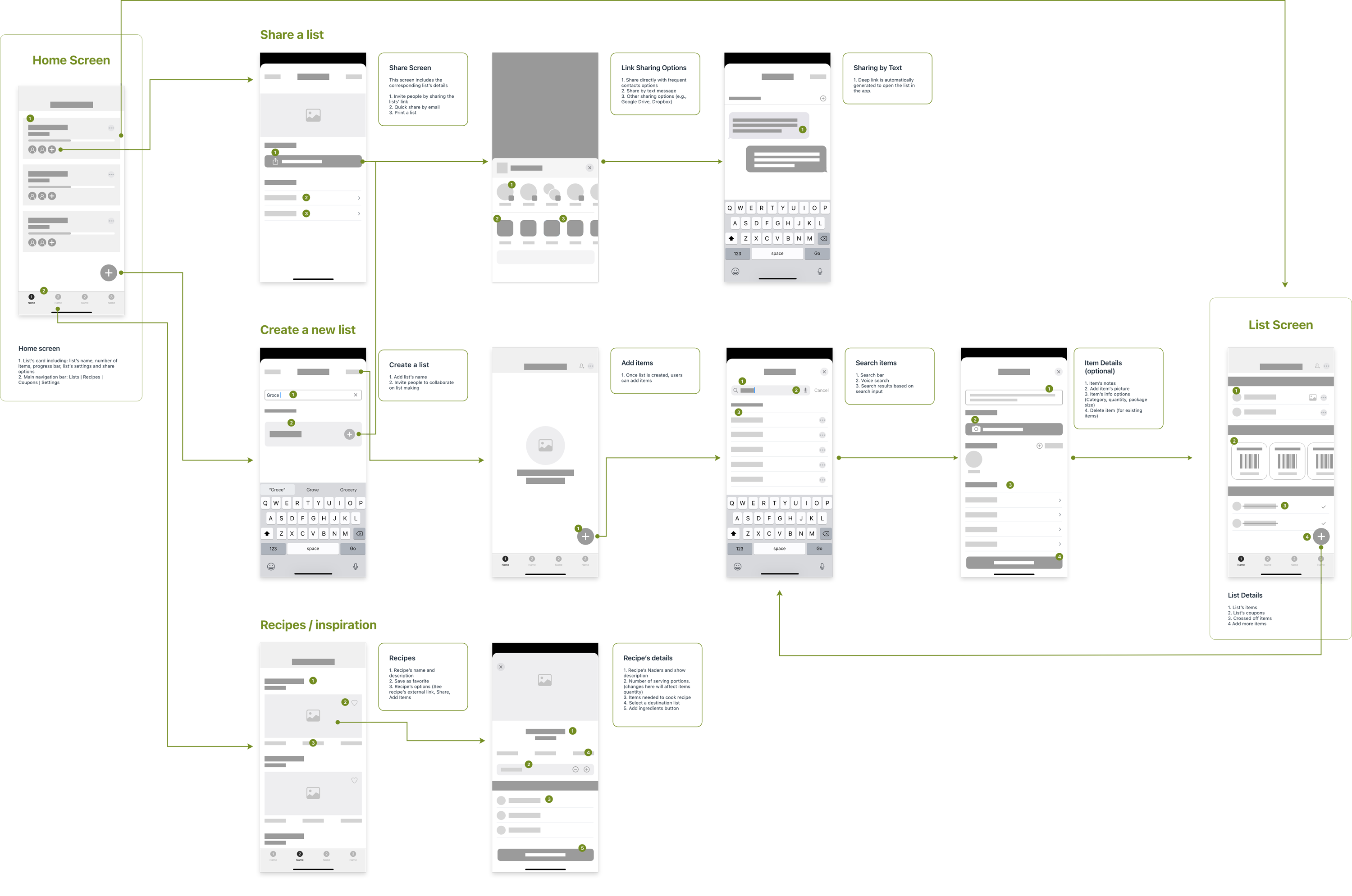
The User Flow
Because of the nature of the project, I had to narrow the scope of the app’s design. To accomplish that, I concentrated the app’s user flow into the essential needs of creating and sharing a list. However, based on the user interviews, there are still uncovered needs that can be addressed in the future, such as: adding store coupons to save money and handling leftovers to reduce food waste.
No Need to Reinvent The Wheel
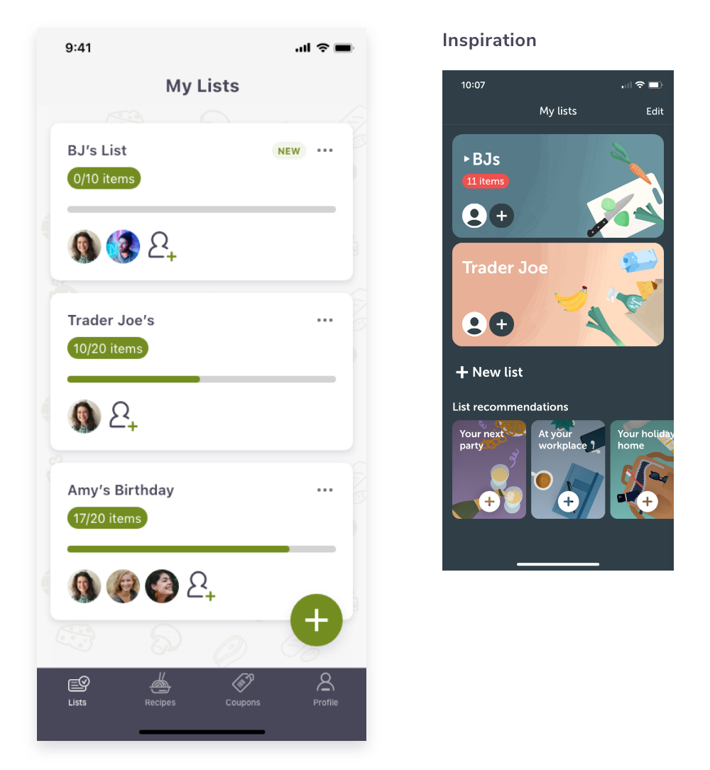
There is no need to reinvent the wheel if there is something in the market that is working and can be improved. With that said, the next stop was to navigate competitors’ apps to identify design patterns that can make users’ life easy when creating and sharing shopping lists. Some of the apps I looked for inspiration from are: AnyList, Listonic, and Bring. Some of the results below:
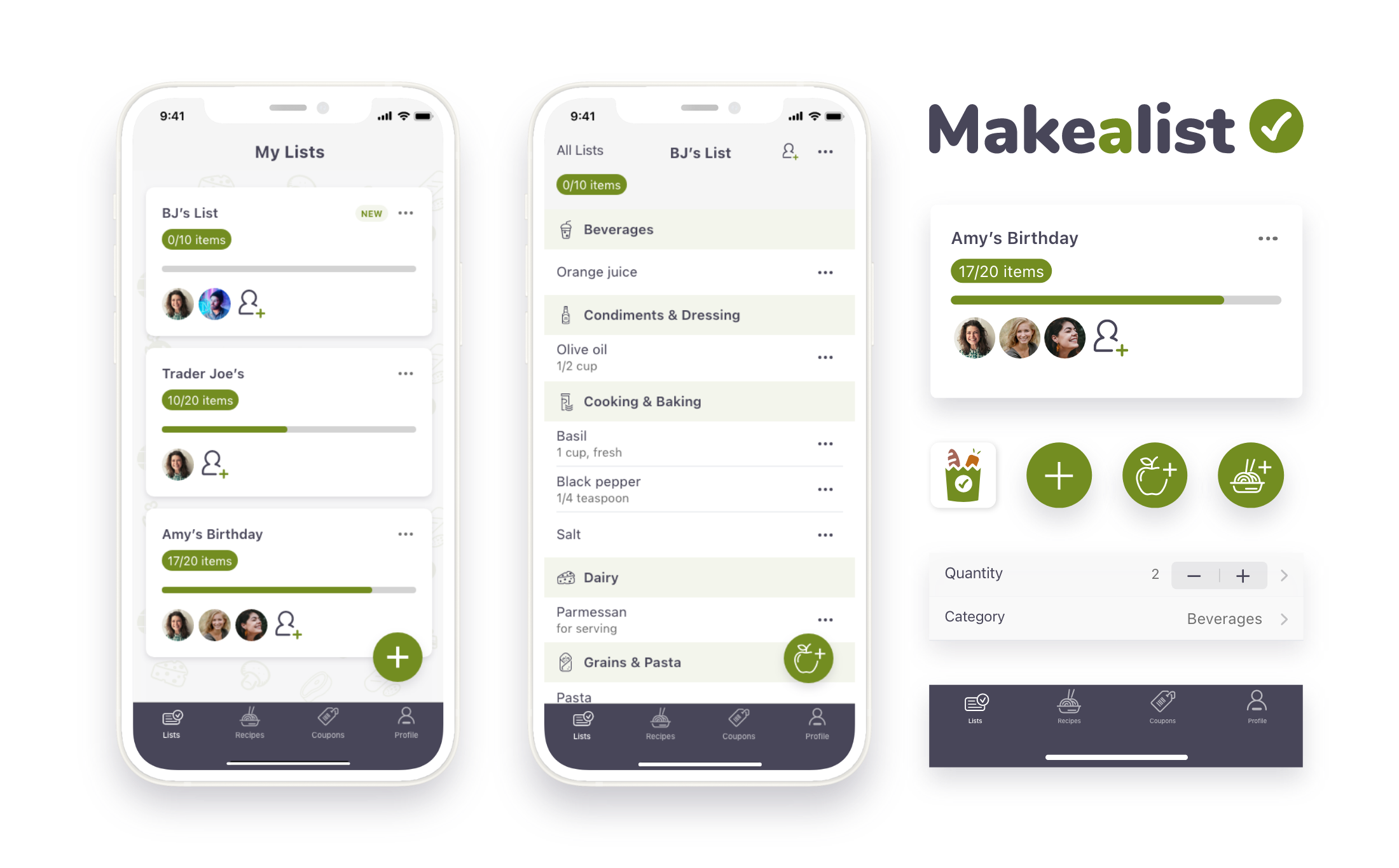
Cards
One of the design patterns I found useful was the use of cards accompanied by a clear information organization to facilitate lists navigation.
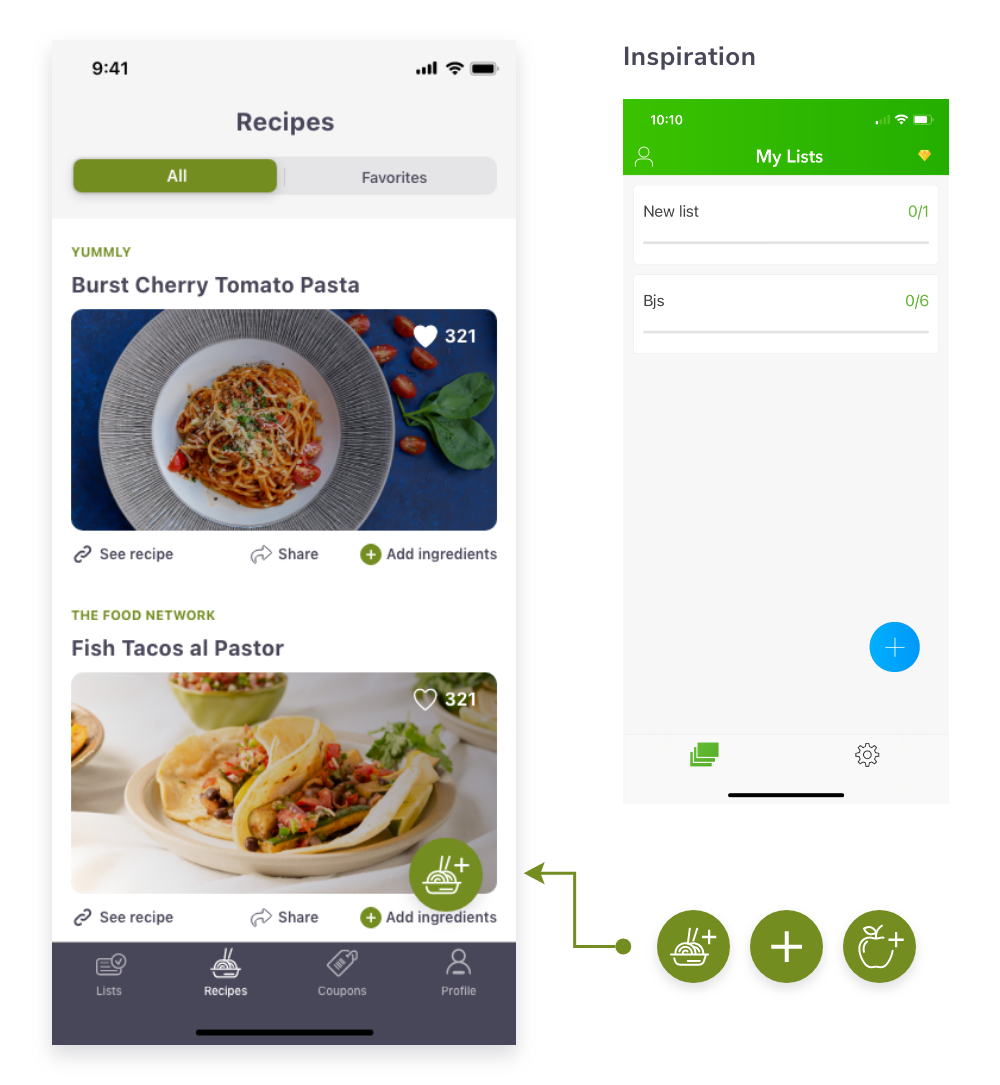
Add Buttons
Users want to create lists, add items, and share lists on the go. So, I made the add buttons for those tasks available all the time on the main screens.
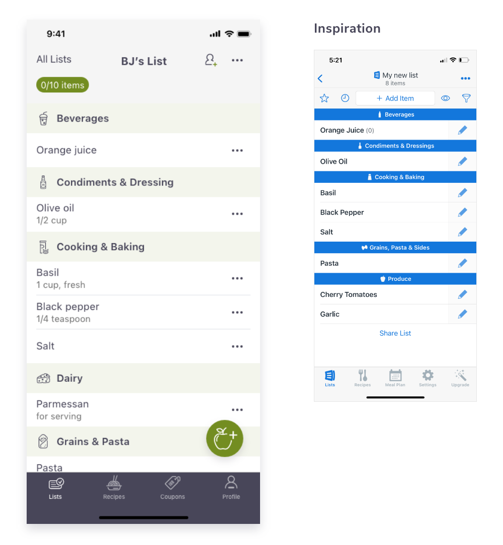
Categories
Users can scan and navigate lists’ items and information with ease, thanks to the addition of categories.
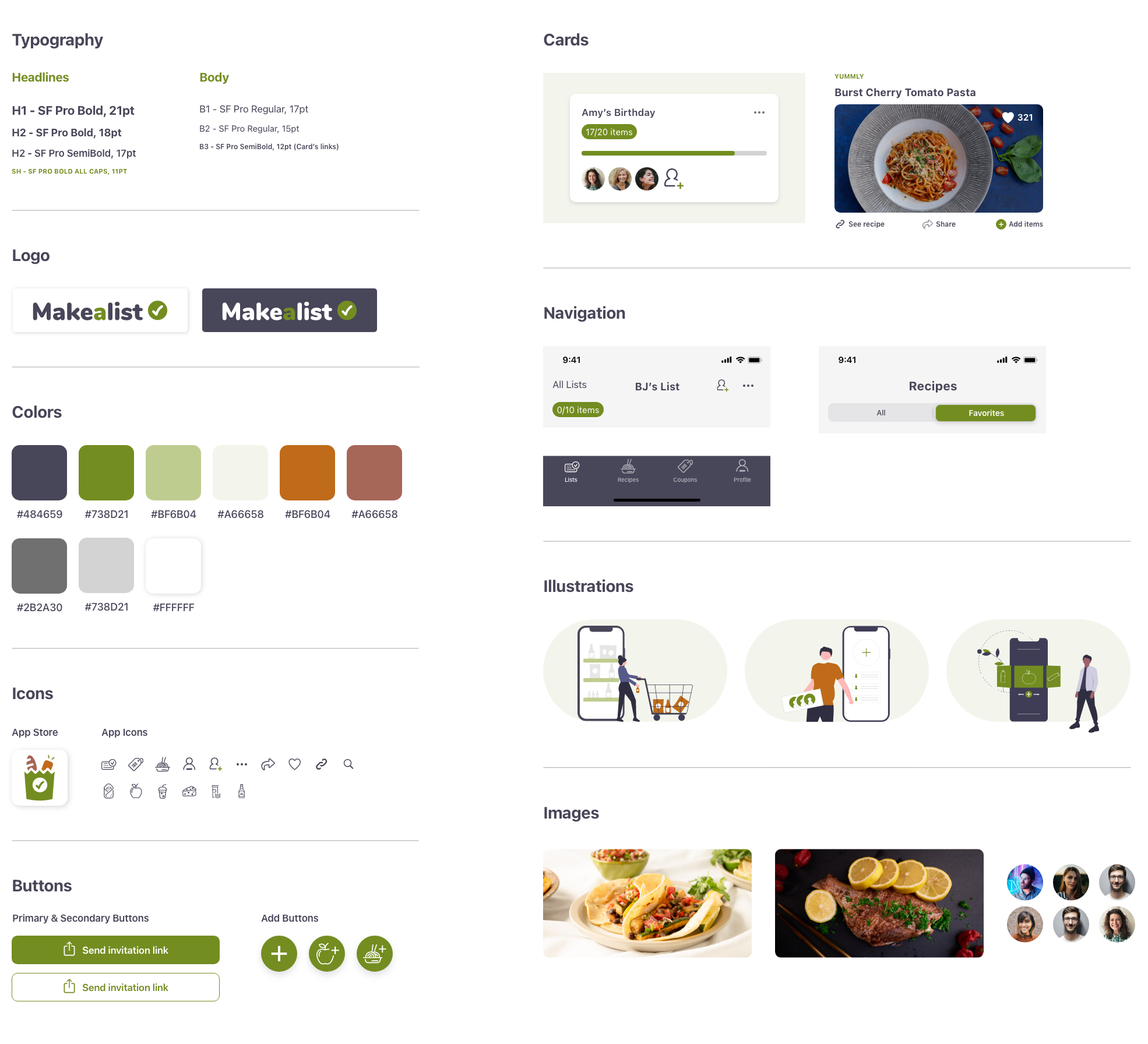
MakeaList UI Kit
The MakeaList branding is meant to reflect freshness and simplicity. To accomplish that, I designed a group of components that work together in the simplest way possible and through colors that don’t overwhelm the user. I also considered it important to stick to the iOS fonts and patterns without losing the app’s style. Like any product, it was an evolving process. The more screens I designed, the more components added to the UI Kit.
Usability Testing
I performed moderated remote and in-person usability testings via Zoom. I used 4 scenarios completed by 3 users aged between 26-37. Among the main goals of the usability testing were to evaluate the overall design flow and identify barriers that prevent the user from accomplishing the given tasks of creating a list, adding items, adding recipe’s ingredients, and sharing a list with friends & family.
Tasks Scenarios
📝 Scenario 1
You are planning to do the groceries for this week at BJ’s. So, you want to create a list called “BJ’s List” for that.
🍊 Scenario 2
Now you want to add orange juice to your BJ’s list.
🍝 Scenario 3
You liked one of the recipe’s in the app. The recipe’s name is “Burst Cherry Tomato Pasta”. You want to add those ingredients to your list.
🧔 Scenario 4
Now you are ready to share the BJ’s list with your partner “Chris Ancelotti”.
Usability Testing Results
Based on the usability testing results, I could conclude that the MVP for the MakeaList app covers the essential needs at the moment of creating and sharing a list. I didn’t detect any barrier that stopped participants from performing the given tasks. Luckily all the participants highlighted how easy to use is the MakeaList app. They qualified the overall design as minimal, uncomplicated, and easy to follow despite none of them being familiar with a similar app.
Note: All three participants were curious about how to see item details and how cross-off items. So, I decided to include those screens as a part of the results.
Final Thoughts
Overall, this case study helped me to understand the MVP concept better. I realized that a prevalent mistake among designers, including me, is to try to solve the whole problem, which is literally something impossible to do. However, a big learning point in this case study was understanding that the MVP concept is a great way to concentrate efforts and allocate resources in the right place at the right time.
Another important takeaway I got from this case study was the construction of the customer journey map. Thanks to the user interviews, I could get a holistic view of the grocery shopping planning experience that later translated to the customer journey map. I also could uncover opportunities to address users’ pain points along the road of the grocery shopping planning experience.
Finally, with the big picture in mind, I could focus my efforts on solving the essential needs of creating and sharing a list. However, I had to leave behind some uncovered needs to be addressed in the future, such as: saving money through the use of coupons and handling leftovers which is perhaps the most painful challenge for users.
